Free Player Retention Guide Get Now
Visualizing data is more than making charts look pretty—it’s about helping people quickly grasp patterns, trends, and insights. For beginners, the key is to start with simple, effective chart types that match the data’s structure and your storytelling goal. Studies show that even a basic bar chart helps viewers interpret categorical comparisons far faster than a table full of numbers.
Visualizing data is more than making charts look pretty—it’s about helping people quickly grasp patterns, trends, and insights. For beginners, the key is to start with simple, effective chart types that match the data’s structure and your storytelling goal. Studies show that even a basic bar chart helps viewers interpret categorical comparisons far faster than a table full of numbers.
Sometimes visualization is a way to explore the data and search for patterns. That is the exploration use case. In this post, we will focus on the communication use case instead. Visualization is great for sharing ideas and findings. Since all communication involves a receiver and a message, we start with these elements:
Ask:
For instance, use bar charts to compare categories, line charts for trends, scatter plots for correlation. Choose based on what decision or understanding you want to convey—not the data alone. Always start with the story, then pick the visualization that best illustrates it.
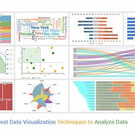
Here are 8 essential techniques every data visualization newcomer should learn—and when to use them:
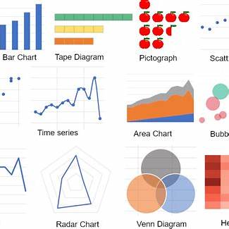
Best for comparing categories (e.g., sales per product, survey answers). They’re intuitive and easy to build—even in Excel or Google Sheets. The data usually includes one category column and another numeric column. A good message here might be that "one category is much lower or higher than other categories".
Ideal for tracking changes over time—such as revenue over months, temperature trends, or website traffic growth. These show the relationship between a numeric value and time. An appropriate message for a line chart could be "monthly sales have been trending downwards/upwards for the last year".
Good for illustrating parts of a whole—like percentage shares. Use sparingly: readers can struggle with interpreting angles and slice sizes if there are too many categories. Much like bar charts, pie charts are good for showing one category column and another numeric column. An appropriate message could be "while you hear many vocal complaints for these users, they make up only 2% of the total user base".
Great for exploring relationships between two numerical variables. You can spot correlations and outliers at a glance. A common type of message conveyed in scatter plots is "these two variables are completely unrelated to each other." Scatter plots show two numeric variables, but there is usually another underlying variable that is usually a category. For example, in comparing "sales" to "costs", there is an inherent assumption that these two variables are for "sales per month" and "costs per month". It does not make sense to compare them otherwise.
Use a color gradient (e.g., darker shades = higher values) to surface patterns in two-dimensional data—popular in correlation analysis, website click tracking, or sales by region and product. Here you have at least three different data columns, and you are trying to communicate how one of those columns changes with other two data columns. An appropriate message for heatmap might be "the number of clicks increases when you place them in lower right side of the screen" - the columns here would be "number of clicks", "horizontal location", "vertical location".
Displays the distribution of a continuous variable grouped into bins (e.g., age ranges, income brackets)—helpful for seeing frequency patterns. What is usually displayed is how a data column varies within a population. Examples are how does height vary in kids of a certain age, or how does income vary across households. Again a more sophisticated visualization. An appropriate message might be "in order to be in the tallest 10% of professional basketball players, you must be at least 6 feet 9 inches". A data savvy audience will also be able to estimate other insights from the chart, such as "66% of the pro basketball players fall within this range".
Like line charts but shaded beneath—excellent for showing cumulative totals or stacked series over time. Here there are at least three different data columns being shown. There is a numeric column such a sales, a categorical column such as product and a column representing a time frame. Bear in mind, this is a slightly more complex visualization showing three different things at the same time. An appropriate message here could be "Cat food is becoming a larger share of our revenue in the past 12 months".
This is a variation of the scatter plot. Take a third data column and represent it as the size of the dot in a scatter plot. This is a more sophisticated visualization that can be used to communicate a more complex message. Continuing from the scatterplot example above, an appropriate message might be "sales and costs are completely unrelated to each other, but it appears that when the amount of data is large, sales and costs are very highly correlated". In this example, "amount of data" is the third data column.
Begin with simple, trusty chart types like bar, line, scatter, histogram, heatmap, and treemap. Listen to the data’s story, tailor your chart to your message—and design with clarity. As you grow more comfortable, expand into interactive dashboards and advanced visuals—but strong fundamentals always lead to clearer insights and better decisions.
For a limited time until December 2025, Sonamine is offering a 60 day money back guarantee to OneSignal customers. Come experience the ease and simplicity of the First Time Spender Nudge package and watch your conversions soar.
For a limited time until December 2025, Sonamine is offering a 60 day money back guarantee to OneSignal customers. Come experience the ease and simplicity of the First Time Spender Nudge package and watch your conversions soar.